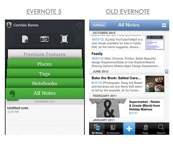
Evernote is on a roll making massive visual changes to its products and Evernote for iOS is the latest to receive a makeover. First it was Skitch 2, which didn’t impress everyone. Then a viral release of Evernote 5 for Mac Beta, pulled due to overwhelming demand. Now it’s their iOS app’s turn. Will the public hate it like Skitch 2 or love it like Evernote 5 for Mac Beta?
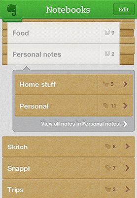
Evernote 5 for iOS now sports an interesting interface designed like a filing cabinet. It’s a far departure from its former boxy Instagram styling, but looks tremendously better. Navigate the app using folders, by pulling them up to access what you want. If you’re into mysteries and investigations you’ll love this design.
The top bar gives you access to your account settings and there’s a little icon for manual syncing. Below the bar are quick access icons to create a new note, take a picture or picture of a document. The latter is optimized for Evernote’s Smart Notebook, an exciting collaboration with legendary notebook maker Moleskine.
Filing (Ever)Notes
Pulling folders out of a filing cabinet is a bit too nostalgic for my tastes, but some may enjoy Evernote’s execution of the concept. Swiping up on the appropriate folder will pull up all of your notes, notebooks, tags, or places. This sounds and looks cool in theory, but the app doesn’t pull it off perfectly. Swiping animations feel sluggish, don’t happen smoothly, and sometimes are delayed on my iPhone 4. It’s also very easy to open your notification center when trying to swipe down to exit a folder.
Blending in with all of your folders is a clever ad for Evernote’s Premium services. It’s disguised as a folder and designed to get free users to upgrade. It may or may not work, but users will take Evernote’s unobtrusive folder over iAds interrupting their experience on any given day. Nice work Evernote!
The view inside of your notebooks and notes hasn’t changed much from the last version. The icon for creating a new note now sits at the top near the title of the notebook. There’s also a sorting option for those that have shared and personal notebooks. Aside from minor font adjustments, all the settings for sorting and searching are located at the top of the page. Inside of notes, a trash icon sits next to the search bar.
Worth the Upgrade
Aside from the sluggish animations for the new homescreen, Evernote 5 for iOS [iTunes] is worth the upgrade. It’s much easier to get navigate the app with fewer taps. I just wish I didn’t have to open the “all notes” folder just to delete one of the first two notes. Don’t let my personal pet peeve stop you from grabbing a solid update from the Evernote team.


